PAUL TOOTH
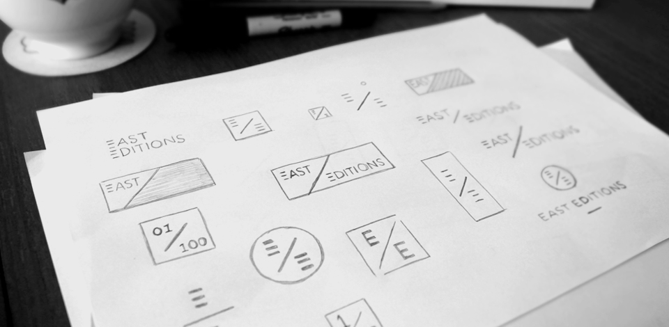
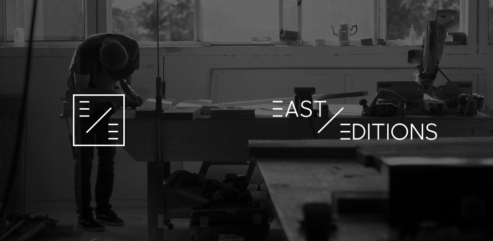
We are both creative people and have graphic design skills, but when it came to designing the East Editions logo and branding we knew it was something we couldn’t do ourselves, we needed an outsider to take our vision and develop our initial branding style, logo and icon for us. So we decided to commission our good friend Paul Tooth who runs a small creative agency called Seeder House, he is a super talented designer and specialises in creating graphics and designing branding for a range of clients.
After sitting down over coffee with Paul and giving him the run down of what East Editions is all about as well as trying to convey to him our very loose visions for how we wanted the whole brand to look and feel like, he went away and basically proceeded to completely nail the logo design and East Editions branding first try! We were so impressed, the logotype and icon he designed for us perfectly embodies East Editions and is something we have been able to go forward with when it came to designing the website and all the other material that goes along with the products and promotion. We can’t thank Paul enough for what he created for us.