GEORGIA HILL
EE: Tell us a little bit about who you are, where you grew up and what you tell people you do for a living?
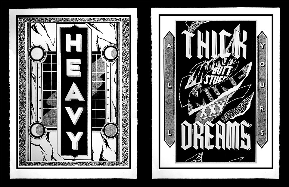
GH: I’m an illustrator and artist, currently living and working in Sydney, Australia, but originally from the Newcastle/Hunter Valley region. I create hand drawn works for clients, commissions, exhibitions and larger murals, all based in a very heavy black and white, lettering and texture based world.
EE: When? Where? and What? was the first piece of artwork you can remember creating?
GH: Oh wow – the first piece I ever remember drawing was in the library of Bolwarra Primary School – I used to spend my lunchtimes sitting in there drawing, in this case a really detailed picture of a very Aussie bloke. He had it all: pot belly, blue singlet, hat with corks hanging off it, a VB and as much leg hair as anyone can draw in 45 minutes. Bit of a weird one for a 5 year old but I was determined to finish it.
EE: Typographer, illustrator, artist, designer? How do all these worlds collide for you?
GH: As I’ve developed my own work, I’ve become more confident to explore different things, and to push myself. I got to a point about a year ago where I realised I could draw letters in my sleep, and that wasn’t so challenging. I’ve always loved texture and pattern but it really took a long time for me to come into my own aesthetic, which has given my work more of an art direction rather than design/client orientated lettering. It’s always shifting and changing but I really enjoy being able to control that and focus on particular aspects or applications.
EE: You spent a year in Berlin. How did this affect your work?
GH: In a very, very big way. I was given the time to really get into detailed pieces, to have confidence in my own style and execution of works, and also all the things that come into your head when you’re overseas that have nothing to do with pen and paper – I realised how important relationships, family and support is, to have a goal and to want to push yourself even when it’s all a bit uncertain.
EE: You create your artworks using a lot of different mediums and techniques including drawing with pen, ink, paint & digital works. You also have been recently painting lots of large scale murals? What’s your favourite medium to get creative with?
GH: I’m really loving larger scale pieces at the moment as it’s forced me to let go of a lot of the details I usually focus on in smaller works, and to substitute this with attention to textures and line. I’m also really looking forward to see what will happen after a few big walls, when I scale my work down again. I feel a bit freer to be loose and play with composition on walls, as the shape, materials and timing varies. It feels good to be a bit uncomfortable on a big scale.
EE: Hand paint or digital? What’s your preference?
GH: Hand paint for sure. I really enjoy playing and experimenting in a digital scope (manipulating type, inverting and blacking out) as it’s so quick and instant, but I know I can only achieve the look and feel I have by hand.
EE: For your East Editions screen prints you moved away from your usual typography works to create a more abstract, experimental artwork? What was the idea for this?
GH: My piece for East Editions focused on a lot of the texture work I’ve been enjoying lately, and manipulating that to sit together in a new and interesting way. I’ve been wanting to do this for a while, but it’s also a bit scary to suddenly not use type when it’s part of your reputation, process and composition. It was a great challenge and pushed me to know my work can stand alone without lettering.
EE: You created three separate illustrations on paper, then ripped them into pieces, finally collaging them all back into one final artwork? What was the process involved in discovering this technique? Had you ever done it before?
GH: I did a very spontaneous test of this ripping approach for The Tate ‘Twenty SIx’ Group Show in Sydney last year – where I illustrated and ripped up three letter G’s. I’d been hoping to experiment with it more and without type, in print and in mural works, so the opportunity to focus solely on textures and pattern for East Editions was perfect timing.
EE: What was your favourite part of the process?
GH: I really love (and hate) that to an extent it’s unpredictable – you never know if the second texture you drew will get lost in the details on another page. But in the ripping and layering, there’s these perfects accidents where things line up or invert, and I love that result is by chance, free of anything digital or deliberate. There’s a new detail to see every time you come back to the piece.
EE: You seem to have had a very busy year painting murals all over the country, exhibiting work in many group shows in Australia and overseas, you also had a solo show in June at Goodspace in Sydney and a more recent project with Nivea. What’s been the best thing you have worked on this year?
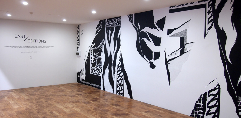
GH: I think I’m always looking forward to the next mural! I really loved the wall I did for First Coat in Toowoomba, and I think to finally do something that big felt like I’d hit a new mark. Also the installation mural I created for the East Editions print launch on the Gold Coast I felt was great in terms of being clean and detailed. I’m enjoying the murals a lot because it’s not just about the work, it’s about being a part of communities – the artists, painters, it’s a much bigger thing than just painting a wall.


